
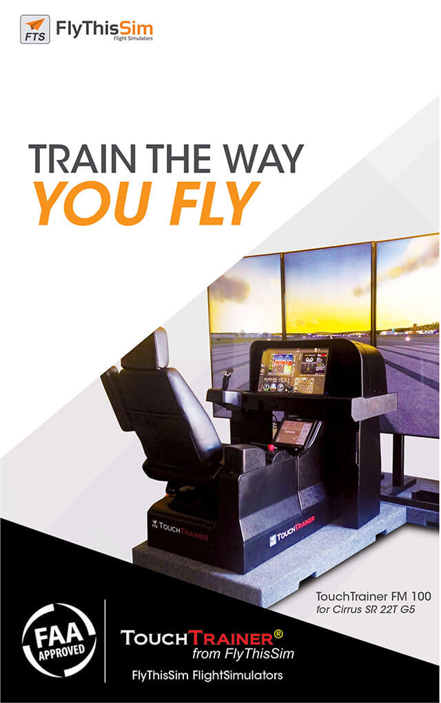
FlyThisSim is a flight simulator manufacturer co-founded by two engineers and flight enthusiasts. After 10 years of operation, they came to us in need of an upgrade for their brands and websites and to gain a competitive edge as they showcase their product in various flight and trade shows in the US.
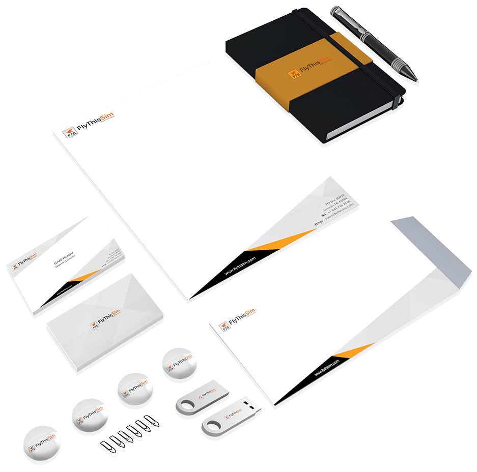
New Branding & VI
Deviating from the original concept of a paper plan, we enhanced the logo with a warmer and modern look from blue and light grey to orange and charcoal. Following the same look, feel, and the symmetric shape of the paper plane, we created the business card, letter head, etc. to serve the operational need of the company.
 |
 |
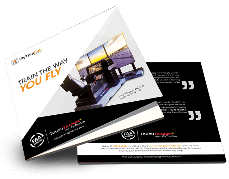
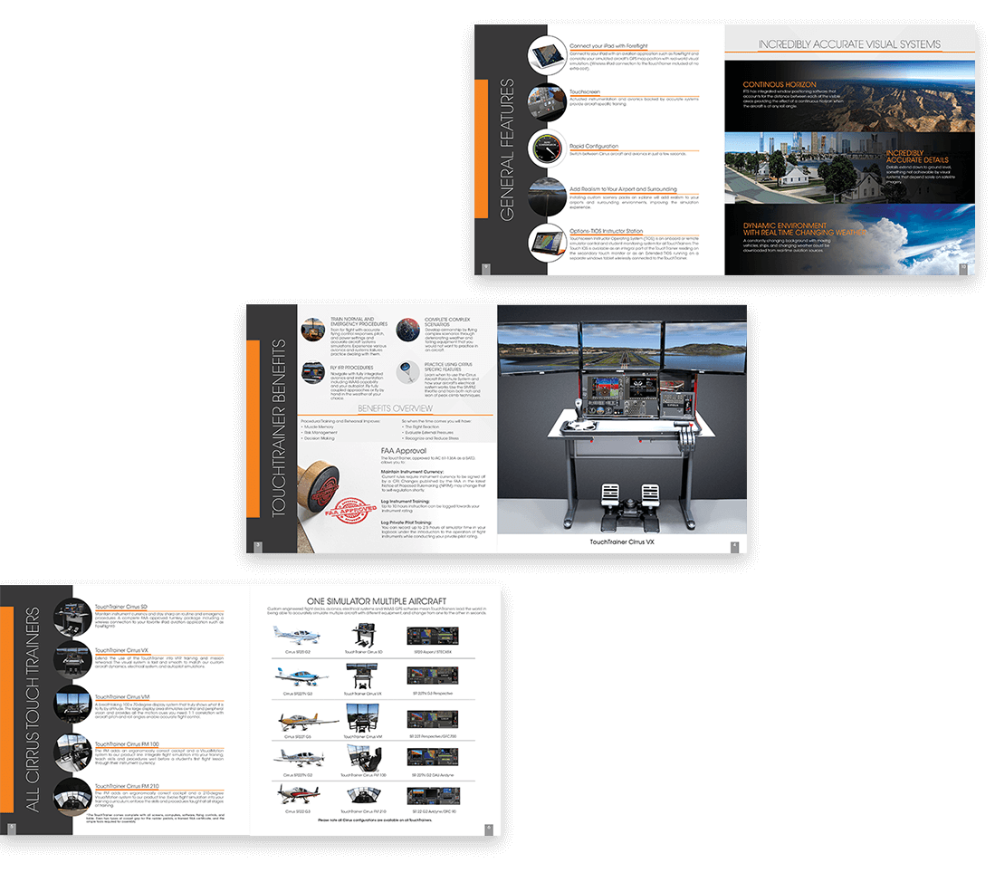
Flight Show Brochure
The brochure was specially designed for the Cirrus Aircraft flight show. We worked with the co-founder and engineers to build the content plan, design and strategic display of the product with the right aircraft type and CTA.
 |
 |
Site design and
development
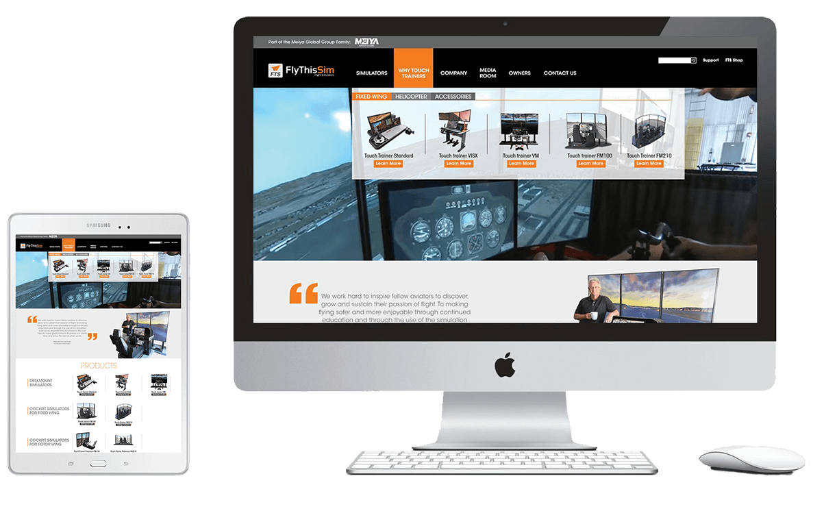
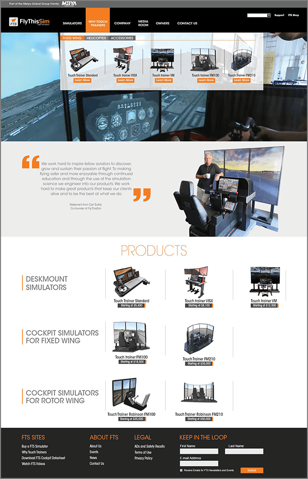
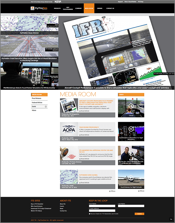
Designing for FlyThisSim, required sifting through copious amounts of technical details for each Flight Simulator, along with ten years of publication material and tutorial/promotional videos. Our challenge was to strategically showcase each item on the website, to highlight the company’s achievements and quality products. The result was a resounding success.
 |
 |
 |